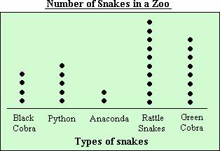
A dot plot is a graphical display of data using dots. It is very similar to pictographs.
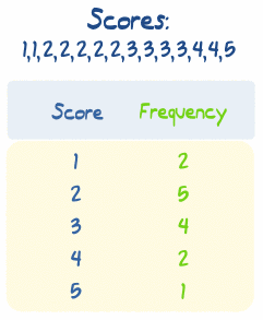
A frequency table is a table that shows a set of numbers/scores and their frequency (how many times each one occurs).
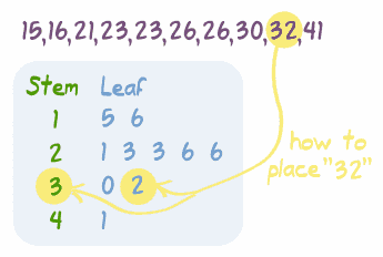
A stem-and-leaf plot is a plot where each data value is split into a "leaf" (usually the last digit) and a "stem" (the other digits). For example "32" is split into "3" (stem) and "2" (leaf). The "stem" values are listed down, and the "leaf" values are listed next to them. This way the "stem" groups the scores and each "leaf" indicates a score within that group.
Here are the basic steps to creating a stem-and-leaf plot:

Last week, we created these three data representations using data from final scores of the Dallas Cowboys games. They did a great job on this assignment and really seemed to enjoy it!
Homework this week will consist of something similar. Your kiddo will need to research some data (height of people, scores of game, age of friends, etc.) and create a dot plot, frequency table, and stem-and-leaf plot to represent this data. They will then need to come up with three questions that can be answered using this data. An example question might be: How many more students scored 80% or greater on the test than 70% or lower? This assignment will be due on Monday, January 26th.
Please let me know if you have any questions!
No comments:
Post a Comment